Some time ago, I finished the Stanford course CS224W Machine Learning with Graphs. This is Part 3 of blog posts series where I share my notes from watching lectures. The rest you can find here: 1, 2, 4.
- Lecture 12 – Network Effects and Cascading Behavior
- Lecture 13 – Probabilistic Contagion and Models of Influence
- Lecture 14 – Influence Maximization in Networks
- Lecture 15 – Outbreak Detection in Networks
- Lecture 16 – Network Evolution
Lecture 12 – Network Effects and Cascading Behavior
Information can spread through networks: behaviors that cascade from node to node like an epidemic:
- Cascading behavior.
- Diffusion of innovations.
- Network effects.
- Epidemics.
Examples of spreading through networks:
- Biological: diseases via contagion.
- Technological: cascading failures, spread of information.
- Social: rumors, news, new technology, viral marketing.
Network cascades are contagions that spread over the edges of the network. It creates a propagation tree, i.e., cascade. “Infection” event in this case can be adoption, infection, activation.
Two ways to model model diffusion:
- Decision based models (this lecture ):
- Models of product adoption, decision making.
- A node observes decisions of its neighbors and makes its own decision.
- Example: you join demonstrations if k of your friends do so.
- Probabilistic models (next lecture):
- Models of influence or disease spreading.
- An infected node tries to “push” the contagion to an uninfected node.
- Example: you “catch” a disease with some probability from each active neighbor in the network.
Decision based diffusion models
Game Theoretic model of cascades:
Based on 2 player coordination game: 2 players – each chooses technology A or B; each player can only adopt one “behavior”, A or B; intuition is such that node v gains more payoff if v’s friends have adopted the same behavior as v.
Payoff matrix for model with two nodes looks as following:
- If both v and w adopt behavior A, they each get payoff a > 0.
- If v and w adopt behavior B, they each get payoff b > 0.
- If v and w adopt the opposite behaviors, they each get 0.
- In some large network: each node v is playing a copy of the game with each of its neighbors. Payoff is the sum of node payoffs over all games.
Calculation of node v:
- Let v have d neighbors.
- Assume fraction p of v’s neighbors adopt A.
- Payoffv = a∙p∙d if v chooses A; Payoffv = b∙(1-p)∙d if v chooses B.
- Thus: v chooses A if p > b / (a+b) = q or p > q (q is payoff threshold).
Example Scenario:
Assume graph where everyone starts with all B. Let small set S of early adopters of A be hard-wired set S – they keep using A no matter what payoffs tell them to do. Assume payoffs are set in such a way that nodes say: if more than q = 50% of my friends take A, I’ll also take A. This means: a = b – ε (ε>0, small positive constant) and then q = ½.
Application: modeling protest recruitment on social networks
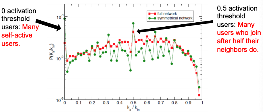
Case: during anti-austerity protests in Spain in May 2011, Twitter was used to organize and mobilize users to participate in the protest. Researchers identified 70 hashtags that were used by the protesters.
- 70 hashtags were crawled for 1 month period. Number of tweets: 581,750.
- Relevant users: any user who tweeted any relevant hashtag and their followers + followees. Number of users: 87,569.
- Created two undirected follower networks:
1. Full network: with all Twitter follow links.
2. Symmetric network with only the reciprocal follow links (i ➞ j and j ➞ i). This network represents “strong” connections only.
Definitions:
- User activation time: moment when user starts tweeting protest messages.
- kin = the total number of neighbors when a user became active.
- ka = number of active neighbors when a user became active.
- Activation threshold = ka/kin. The fraction of active neighbors at the time when a user becomes active.
- If ka/kin ≈ 0, then the user joins the movement when very few neighbors are active ⇒ no social pressure.
- If ka/kin ≈ 1, then the user joins the movement after most of its neighbors are active ⇒ high social pressure.
Authors define the information cascades as follows: if a user tweets a message at time t and one of its followers tweets a message in (t, t + Δt), then they form a cascade.

To identify who starts successful cascades, authors use method of k-core decomposition:
- k-core: biggest connected subgraph where every node has at least degree k.
- Method: repeatedly remove all nodes with degree less than k.
- Higher k-core number of a node means it is more central.
Picture below shows the K-core decomposition of the follow network: red nodes start successful cascades and they have higher k-core values. So, successful cascade starters are central and connected to equally well connected users.

To summarize the cascades on Twitter: users have uniform activation threshold, with two local peaks, most cascades are short, and successful cascades are started by central (more core) users.
So far, we looked at Decision Based Models that are utility based, deterministic and “node” centric (a node observes decisions of its neighbors and makes its own decision – behaviors A and B compete, nodes can only get utility from neighbors of same behavior: A-A get a, B-B get b, A-B get 0). The next model of cascading behavior is the extending decision based models to multiple contagions.
Extending the Model: Allow people to adopt A and B
Let’s add an extra strategy “AB”:
- AB-A : gets a.
- AB-B : gets b.
- AB-AB : gets max(a, b).
- Also: some cost c for the effort of maintaining both strategies (summed over all interactions).
- Note: a given node can receive a from one neighbor and b from another by playing AB, which is why it could be worth the cost c.
Cascades and compatibility model: every node in an infinite network starts with B. Then, a finite set S initially adopts A. Run the model for t=1,2,3,…: each node selects behavior that will optimize payoff (given what its neighbors did in at time t-1). How will nodes switch from B to A or AB?
Let’s solve the model in a general case: infinite path starts with all Bs. Payoffs for w: A = a, B = 1, AB = a+1-c. For what pairs (c,a) does A spread? We need to analyze two cases for node w (different neighbors situations) and define what w would do based on the values of a and c?
- A-w-B:
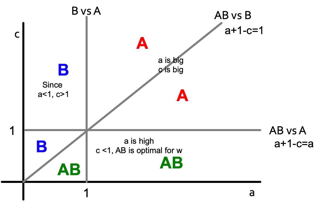
- AB-w-B:
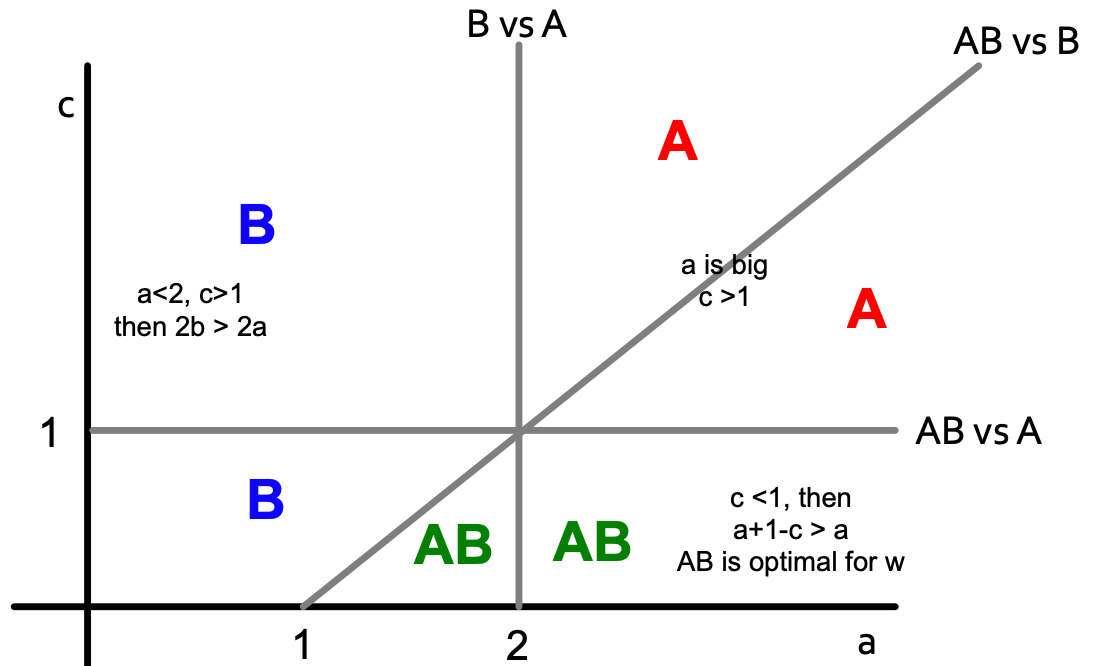
If we combine two pictures, we get the following:

To summarise: if B is the default throughout the network until new/better A comes along, what happens:
- Infiltration: if B is too compatible then people will take on both and then drop the worse one (B).
- Direct conquest: if A makes itself not compatible – people on the border must choose. They pick the better one (A).
- Buffer zone: if you choose an optimal level then you keep a static “buffer” between A and B.
Lecture 13 – Probabilistic Contagion and Models of Influence
So far, we learned deterministic decision-based models where nodes make decisions based on pay-off benefits of adopting one strategy or the other. Now, we will do things by observing data because in cascades spreading like epidemics, there is lack of decision making and the process of contagion is complex and unobservable (in some cases it involves (or can be modeled as) randomness).
Simple model: Branching process
- First wave: a person carrying a disease enters the population and transmits to all she meets with probability q. She meets d people, a portion of which will be infected.
- Second wave: each of the d people goes and meets d different people. So we have a second wave of d ∗ d = d2 people, a portion of which will be infected.
- Subsequent waves: same process.
Epidemic model based on random trees
- A patient meets d new people and with probability q>0 she infects each of them.
- Epidemic runs forever if: lim (h→∞) p(h) > 0 (p(h) is probability that a node at depth h is infected.
- Epidemic dies out if: lim (h→∞) p(h) = 0.
So, we need to find lim (h→∞) p(h) based on q and d. For p(h) to be recurrent (parent-child relation in a tree):

Then lim (h→∞) p(h) equals the result of iterating f(x) = 1 – (1 – q ⋅ x)d where x1 = f(1) = 1 (since p1 = 1), x2 = f(x1), x3 = f(x2), …
If we want the epidemic to die out, then iterating f(x) must go to zero. So, f(x) must be below y = x.
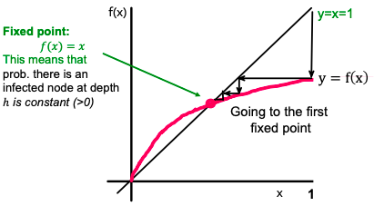
Also, f′(x) is non-decreasing, and f′(0) = d ⋅ q, which means that for d ⋅ q > 1, the curve is above the line, and we have a single fixed point of x = 1 (single because f′ is not just monotone, but also non-increasing). Otherwise (if d ⋅ q > 1), we have a single fixed point x = 0. So a simple result: depending on how d ⋅ q compares to 1, epidemic spreads or dies out.
Now we come to the most important number for epidemic R0 = d ⋅ q (d ⋅ q is expected # of people that get infected). There is an epidemic if R0 ≥ 1.
Only R0 matters:
- R0 ≥ 1: epidemic never dies and the number of infected people increases exponentially.
- R0 < 1: Epidemic dies out exponentially quickly.
Measures to limit the spreading: When R0 is close 1, slightly changing q or d can result in epidemics dying out or happening:
- Quarantining people/nodes [reducing d].
- Encouraging better sanitary practices reduces germs spreading [reducing q].
- HIV has an R0 between 2 and 5.
- Measles has an R0 between 12 and 18.
- Ebola has an R0 between 1.5 and 2.
Application: Social cascades on Flikr and estimating R0 from real data
The paper Characterizing social cascades in Flickr [Cha et al. ACM WOSN 2008] has all details about the application.
Dataset:
- Flickr social network: users are connected to other users via friend links; a user can “like/favorite” a photo.
- Data: 100 days of photo likes; 2 million of users; 34,734,221 likes on 11,267,320 photos.
Cascades on Flickr:
- Users can be exposed to a photo via social influence (cascade) or external links.
- Did a particular like spread through social links?
- No, if a user likes a photo and if none of his friends have previously liked the photo.
- Yes, if a user likes a photo after at least one of her friends liked the photo → Social cascade.
- Example social cascade: A → B and A → C → E.
Now let’s estimate R0 from real data. Since R0 = d ⋅ q, need to estimate q first: given an infected node count the proportion of its neighbors subsequently infected and average. Then R0 = q ⋅ d ⋅ (avg(di2)/(avg di )2 where di is degree of node i (last part in the formula is the correction factor due to skewed degree distribution of the network).
Thus, given the start node of a cascade, empirical R0 is the count of the fraction of directly infected nodes.
Authors find that R0 correlates across all photos.
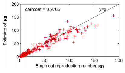
The basic reproduction number of popular photos on Flickr is between 1 and 190. This is much higher than very infectious diseases like measles, indicating that social networks are efficient transmission media and online content can be very infectious.
Epidemic models
[Off-top: the lecture was in November 2019 when COVID-19 just started in China – students were prepared to do analysis of COVID spread in 2020]
Let virus propagation have 2 parameters:
- (Virus) Birth rate β: probability that an infected neighbor attacks.
- (Virus) Death rate δ: probability that an infected node heals.
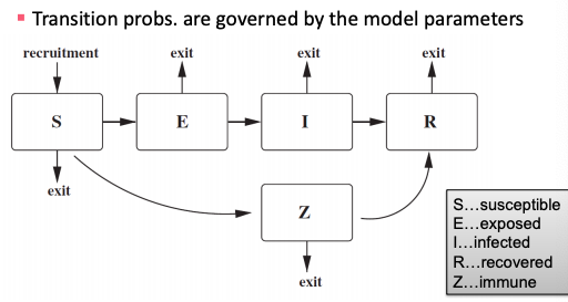
General scheme for epidemic models: each node can go through several phases and transition probabilities are governed by the model parameters.
SIR model
- Node goes through 3 phases: Susceptible -> Infected -> Recovered.
- Models chickenpox or plague: once you heal, you can never get infected again.
- Assuming perfect mixing (the network is a complete graph) the model dynamics are:

where β is transition probability from susceptible to infected phase, δ is transition probability from infected to recovered phase.

SIS model
- Susceptible-Infective-Susceptible (SIS) model.
- Cured nodes immediately become susceptible.
- Virus “strength”: s = β / δ.
- Models flu: susceptible node becomes infected; the node then heals and become susceptible again.
- Assuming perfect mixing (a complete graph):


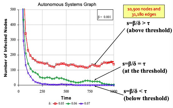
Epidemic threshold of an arbitrary graph G with SIS model is τ, such that: if virus “strength” s = β / δ < τ the epidemic can not happen (it eventually dies out).
τ = 1/ λ1,A where λ is the largest eigenvalue of adjacency matrix A of G.
SEIR model
Model with phases: Susceptible -> Exposed -> Infected -> Recovered. Ebola outbreak in 2014 is an example of the SEIR model. Paper Gomes et al., 2014 estimates Ebola’s R0 to be 1.5-2.

SEIZ model
SEIZ model is an extension of SIS model (Z stands for sceptics).

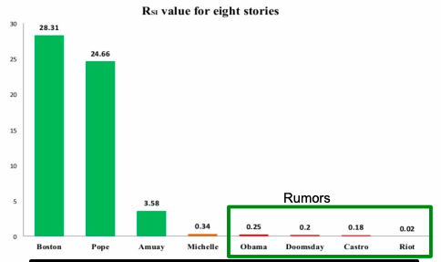
Paper Jin et al. 2013 applies SEIZ for the modeling of News and Rumors on Twitter. They use tweets from eight stories (four rumors and four real) and fit SEIZ model to data. SEIZ model is fit to each cascade to minimize the difference between the estimated number of rumor tweets by the model and number of rumor tweets: |I(t) – tweets(t)|.
To detect rumors, the use new metric (parameters are the same as on figure above):

RSI is a kind of flux ratio, the ratio of effects entering E to those leaving E.
All parameters learned by model fitting to real data.
Independent Cascade Model
Initially some nodes S are active. Each edge (u,v) has probability (weight) puv. When node u becomes active/infected, it activates each out-neighbor v with probability puv. Activations spread through the network.
Independent cascade model is simple but requires many parameters. Estimating them from data is very hard [Goyal et al. 2010]. The simple solution is to make all edges have the same weight (which brings us back to the SIR model). But it is too simple. We can do something better with exposure curves.
The link from exposure to adoption:
- Exposure: node’s neighbor exposes the node to the contagion.
- Adoption: the node acts on the contagion.
Probability of adopting new behavior depends on the total number of friends who have already adopted. Exposure curves show this dependence.

Exposure curves are used to show diffusion in viral marketing, e.g. when senders and followers of recommendations receive discounts on products (what is the probability of purchasing given number of recommendations received?) or group memberships spread over the social network (How does probability of joining a group depend on the number of friends already in the group?).
Parameters of the exposure curves:
- Persistence of P is the ratio of the area under the curve P and the area of the rectangle of height max(P), width max(D(P)).
- D(P) is the domain of P.
- Persistence measures the decay of exposure curves.
- Stickiness of P is max(P): the probability of usage at the most effective exposure.
Paper Romero et al. 2011 studies exposure curve parameters for twitter data. They find that:
- Idioms and Music have lower persistence than that of a random subset of hashtags of the same size.
- Politics and Sports have higher persistence than that of a random subset of hashtags of the same size.
- Technology and Movies have lower stickiness than that of a random subset of hashtags. Music has higher stickiness than that of a random subset of hashtags (of the same size).
Lecture 14 – Influence Maximization in Networks
Viral marketing is based on the fact that we are more influenced by our friends than strangers. For marketing to be viral, it identifies influential customers, convinces them to adopt the product (offer discount or free samples) and then these customers endorse the product among their friends.
Influence maximisation is a process (given a directed graph and k>0) of finding k seeds to maximize the number of influenced people (possibly in many steps).
There exists two classical propagation models: linear threshold model and independent cascade model.
Linear threshold model
- A node v has a random threshold θv ~ U[0.1].
- A node v is influenced by each neighbor w according to a weight bv,w such that Σbv,w ≤ 1.
- A node v becomes active when at least (weighted) θv fraction of its neighbors are active: Σbv,w ≥ 0.
Probabilistic Contagion – Independent cascade model
- Directed finite G = (V, E).
- Set S starts out with new behavior. Say nodes with this behavior are “active”.
- Each edge (v,w) has a probability pvw.
- If node v is active, it gets one chance to make w active, with probability pvw. Each edge fires at most once. Activations spread through the network.
- Scheduling doesn’t matter. If u, v are both active at the same time, it doesn’t matter which tries to activate w first. But the time moves in discrete steps.
Most influential set of size k: set S of k nodes producing largest expected cascade size f(S) if activated. It translates to optimization problem max f(S). Set S is more influential if f(S) is larger.
Approximation algorithm for influence maximization
Influence maximisation is NP-complete (the optimisation problem is max(over S of size k) f(S) to find the most influential set S on k nodes producing largest expected cascade size f(S) if activated). But there exists an approximation algorithm:
- For some inputs the algorithm won’t find a globally optimal solution/set OPT.
- But we will also prove that the algorithm will never do too badly either. More precisely, the algorithm will find a set S that where f(S) ≥ 0.63*f(OPT), where OPT is the globally optimal set.
Consider a Greedy Hill Climbing algorithm to find S. Input is the influence set Xu of each node u: Xu = {v1, v2, … }. That is, if we activate u, nodes {v1, v2, … } will eventually get active.The algorithm is as following: at each iteration i activate the node u that gives largest marginal gain: max (over u) f(Si-1 ∪ {u}).

For example on the picture above:
- Evaluate f({a}) , … , f({e}), pick argmax of them.
- Evaluate f({d,a}) , … , f({d,e}), pick argmax.
- Evaluate f({d,b,a}) , … , f({d,b,e}), pick argmax.
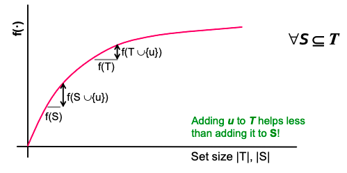
Hill climbing produces a solution S where: f(S) ≥ (1-1/e)*f(OPT) or (f(S)≥ 0.63*f(OPT)) (referenced to Nemhauser, Fisher, Wolsey ’78, Kempe, Kleinberg, Tardos ‘03). This claim holds for functions f(·) with 2 properties (lecture contains proves for both properties, I omit them here):
- f is monotone: (activating more nodes doesn’t hurt) if S ⊆ T then f(S) ≤ f(T) and f({}) = 0.
- f is submodular (activating each additional node helps less): adding an element to a set gives less improvement than adding it to one of its subsets: ∀ S ⊆ T

where the left-hand side is a gain of adding a node to a small set, the right-hand side is a gain of adding a node to a large set.
The bound (f(S)≥ 0.63 * f(OPT)) is data independent. No matter what is the input data, we know that the Hill-Climbing will never do worse than 0.63*f(OPT).
Evaluate of influence maximization ƒ(S) is still an open question of how to compute it efficiently. But there are very good estimates by simulation: repeating the diffusion process often enough (polynomial in n; 1/ε). It achieves (1± ε)-approximation to f(S).
Greedy approach is slow:
- For a given network G, repeat 10,000s of times:
- flip the coin for each edge and determine influence sets under coin-flip realization.
- each node u is associated with 10,000s influence sets Xui .
- Greedy’s complexity is O(k ⋅ n ⋅ R ⋅ m) where n is the number of nodes in G, k is the number of nodes to be selected/influenced, R is the number of simulation rounds (number possible worlds), m is the number of edges in G.
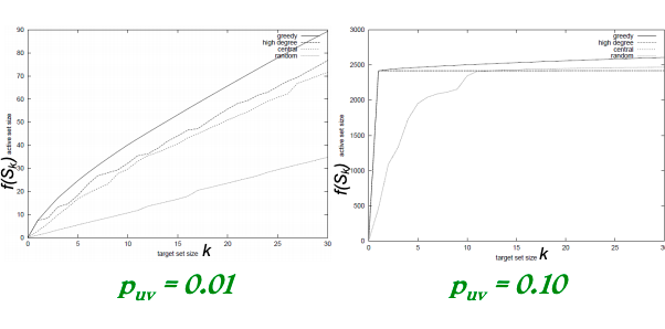
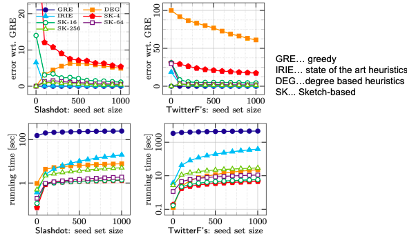
Experiment data
- A collaboration network: co-authorships in papers of the arXiv high-energy physics theory: 10,748 nodes, 53,000 edges. Example of a cascade process: spread of new scientific terminology/method or new research area.
- Independent Cascade Model: each user’s threshold is uniform random on [0,1].
- Case 1: uniform probability p on each edge.
- Case 2: Edge from v to w has probability 1/deg(w) of activating w.
- Simulate the process 10,000 times for each targeted set. Every time re-choosing edge outcomes randomly.
- Compare with other 3 common heuristics:
- Degree centrality: pick nodes with highest degree.
- Closeness centrality: pick nodes in the “center” of the network.
- Random nodes: pick a random set of nodes.
- Greedy algorithm outperforms other heuristics (as shown on pictures below).

Speeding things up: sketch-based algorithms
Recap that to perform influence maximization we need to generate a number R of possible worlds and then identify k nodes with the largest influence in these possible worlds. To solve the problem that for any given node set, evaluating its influence in a possible world takes O(m) time (m is the number of edges), we will use sketches to reduce estimation time from O(m) to O(1).
Idea behind sketches:
- Compute small structure per node from which to estimate its influence. Then run influence maximization using these estimates.
- Take a possible world G(i). Give each node a uniform random number from [0,1]. Compute the rank of each node v, which is the minimum number among the nodes that v can reach.
- Intuition: if v can reach a large number of nodes then its rank is likely to be small. Hence, the rank of node v can be used to estimate the influence of node v a graph in a possible word G(i).
Sketches have a problem: influence estimation based on a single rank/number can be inaccurate:
- One solution is to keep multiple ranks/numbers, e.g., keep the smallest c values among the nodes that v can reach. It enables an estimate on union of these reachable sets.
- Another solution is to keep multiple ranks (say c of them): keep the smallest c values among the nodes that v can reach in all possible worlds considered (but keep the numbers fixed across the worlds).
Sketch-based Greedy algorithm
Steps of the algorithm:
- Generate a number of possible worlds.
- Construct reachability sketches for all node:
- Result: each node has c ranks.
- Run Greedy for influence maximization:
- Whenever Greedy asks for the influence of a node set S, check ranks and add a u node that has the smallest value (lexicographically).
- After u is chosen, find its influence set of nodes f(u), mark them as infected and remove their “numbers” from the sketches of other nodes.
Guarantees:
- Expected running time is near-linear in the number of possible worlds.
- When c is large, it provides (1 − 1 / ε − ε) approximation with respect to the possible worlds considered.
Advantages:
- Expected near-linear running time.
- Provides an approximation guarantee with respect to the possible worlds considered.
Disadvantage:
- Does not provide an approximation guarantee on the ”true” expected influence.
Lecture 15 – Outbreak Detection in Networks
The problem this lecture discusses: given a dynamic process spreading over a network we want to select a set of nodes to detect the process effectively. There are many applications:
- Epidemics (given a real city water distribution network and data on how contaminants spread in the network detect the contaminant as quickly as possible).
- Influence propagation (which users/news sites should one follow to detect cascades as effectively as possible?).
- Network security.
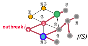
Problem setting for Contamination problem: given graph G(V, E), data about how outbreaks spread over the for each outbreak i we know the time T(u,i) when outbreak i contaminates node u. The goal is to select a subset of nodes S that maximizes the expected reward for detecting outbreak i: max f(S) = Σ p(i) fi(S) subject to cost(S) < B where p(i) is the probability of outbreak i occurring, f(i) is the reward for detecting outbreak i using sensors S.
Generally, the problem has two parts:
- Reward (one of the following three):
- Minimize time to detection.
- Maximize number of detected propagations.
- Minimize the number of infected people.
- Cost (context dependent):
- Reading big blogs is more time consuming.
- Placing a sensor in a remote location is expensive.
Let set a penalty πi(t) for detecting outbreak i at time t. Then for all three reward settings detecting sooner does not hurt:
- Time to detection (DT): how long does it take to detect a contamination?
- Penalty for detecting at time t: πi(t) = t.
- Detection likelihood (DL): how many contaminations do we detect?
- Penalty for detecting at time t: πi(t) = 0, πi(∞) = 1. Note, this is a binary outcome: we either detect or not.
- Population affected (PA): how many people drank contaminated water?
- Penalty for detecting at time t: πi(t) = {# of infected nodes in outbreak i by time t}.
Now, let’s define fi(S) as penalty reduction: fi(S) = πi(∞) − πi(T(S, i)). With this we can observe diminishing returns:
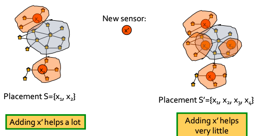
Now we can see that objective function is submodular (recall from previous lecture: f is submodular if activating each additional node helps less).
What do we know about optimizing submodular functions?
- Hill-climbing (i.e., greedy) is near optimal: (1 − 1 / e ) ⋅ OPT.
- But this only works for unit cost case (each sensor costs the same):
- For us each sensor s has cost c(s).
- Hill-climbing algorithm is slow: at each iteration we need to re-evaluate marginal gains of all nodes.
- Runtime O(|V| · K) for placing K sensors.
Towards a new algorithm
Consider the following algorithm to solve the outbreak detection problem: Hill-climbing that ignores cost:
- Ignore sensor cost c(s).
- Repeatedly select sensor with highest marginal gain.
- Do this until the budget is exhausted.
But it can fail arbitrarily badly. There exists a problem setting where the hill-climbing solution is arbitrarily far from OPT. Next we come up with an example.
Bad example when we ignore cost:
- n sensors, budget B.
- s1: reward r, cost c.
- s2…sn: reward r − ε, c = 1.
- Hill-climbing always prefers more expensive sensor s1 with reward r (and exhausts the budget). It never selects cheaper sensors with reward r − ε → For variable cost it can fail arbitrarily badly.
Bad example when we optimize benefit-cost ratio (greedily pick sensor si that maximizes benefit to cost ratio):
- Budget B.
- 2 sensors s1 and s2: costs c(s1) = ε, c(s1) = B; benefit (only 1 cascade): f(s1) = 2ε, f(s2) = B.
- Then the benefit-cost ratio is: f(s1) / c(s1) = 2 and f(s2) / c(s2) = 1. So, we first select s1 and then can not afford s2 → We get reward 2ε instead of B. Now send ε → 0 and we get an arbitrarily bad solution.
- This algorithm incentivizes choosing nodes with very low cost, even when slightly more expensive ones can lead to much better global results.
The solution is the CELF (Cost-Effective Lazy Forward-selection) algorithm. It has two passes: set (solution) S′ – use benefit-cost greedy and Set (solution) S′′ – use unit-cost greedy. Final solution: S = arg max ( f(S’), f(S”)).
CELF is near optimal [Krause&Guestrin, ‘05]: it achieves ½(1-1/e) factor approximation. This is surprising: we have two clearly suboptimal solutions, but taking best of the two is guaranteed to give a near-optimal solution.
Speeding-up Hill-Climbing: Lazy Evaluations
Idea: use δi as upper-bound on δj (j > i). Then for lazy hill-climbing keep an ordered list of marginal benefits δi from the previous iteration and re-evaluate δi only for top node, then re-order and prune.
CELF (using Lazy evaluation) runs 700 times faster than greedy hill-climbing algorithm:

Data Dependent Bound on the Solution Quality
The (1-1/e) bound for submodular functions is the worst case bound (worst over all possible inputs). Data dependent bound is a value of the bound dependent on the input data. On “easy” data, hill climbing may do better than 63%. Can we say something about the solution quality when we know the input data?
Suppose S is some solution to f(S) s.t. |S| ≤ k ( f(S) is monotone & submodular):
- Let OPT = {ti, … , tk} be the OPT solution.
- For each u let δ(u) = f(S ∪ {u} − f(S).
- Order δ(u) so that δ(1) ≥ δ(2) ≥ ⋯
- Then: f(OPT) ≤ f(S) + ∑δ(i).
- Note: this is a data dependent bound (δ(i) depends on input data). Bound holds for any algorithm. It makes no assumption about how S was computed. For some inputs it can be very “loose” (worse than 63%).
Case Study: Water Network
Real metropolitan area water network with V = 21,000 nodes and E = 25,000 pipes. Authors [Ostfeld et al., J. of Water Resource Planning] used a cluster of 50 machines for a month to simulate 3.6 million epidemic scenarios (random locations, random days, random time of the day).
Main results:
- Data-dependent bound is much tighter (gives more accurate estimate of algorithmic performance).
- Placement heuristics perform much worse.
- CELF is much faster than greedy hill-climbing (but there might be datasets/inputs where the CELF will have the same running time as greedy hill-climbing):

- Different objective functions give different sensor placements:

Case Study: Cascades in blogs
Setup:
- Crawled 45,000 blogs for 1 year.
- Obtained 10 million news posts and identified 350,000 cascades.
- Cost of a blog is the number of posts it has.
Main results:
- Online bound turns out to be much tighter: 87% instead of 32.5%.
- Heuristics perform much worse: one really needs to perform the optimization.
- CELF runs 700 times faster than a simple hill-climbing algorithm.

CELF has 2 sub-algorithms:
- Unit cost: CELF picks large popular blogs.
- Cost-benefit: cost proportional to the number of posts.
- We can do much better when considering costs.
- But there is a problem: CELF picks lots of small blogs that participate in few cascades. Thus, we pick best solution that interpolates between the costs -> we can get good solutions with few blogs and few posts.
We want to generalize well to future (unknown) cascades. Limiting selection to bigger blogs improves generalization:

Lecture 16 – Network Evolution
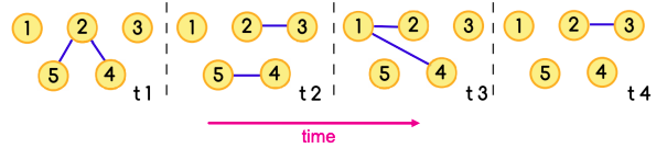
Evolving networks are networks that change as a function of time. Almost all real world networks evolve either by adding or removing nodes or links over time. Examples are social networks (people make and lose friends and join or leave the network), internet, web graphs, e-mail, phone calls, P2P networks, etc.
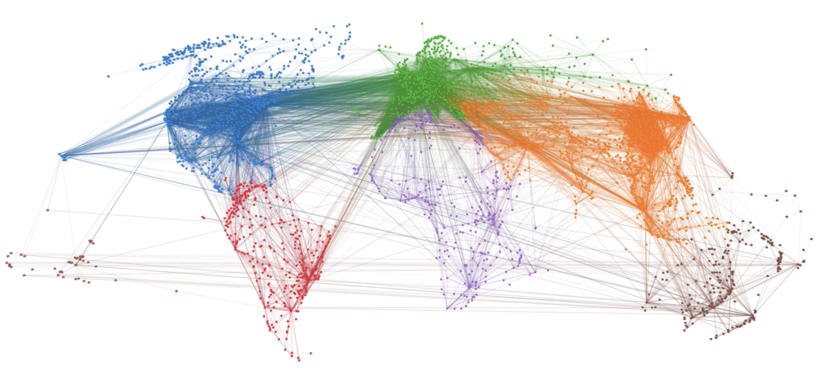
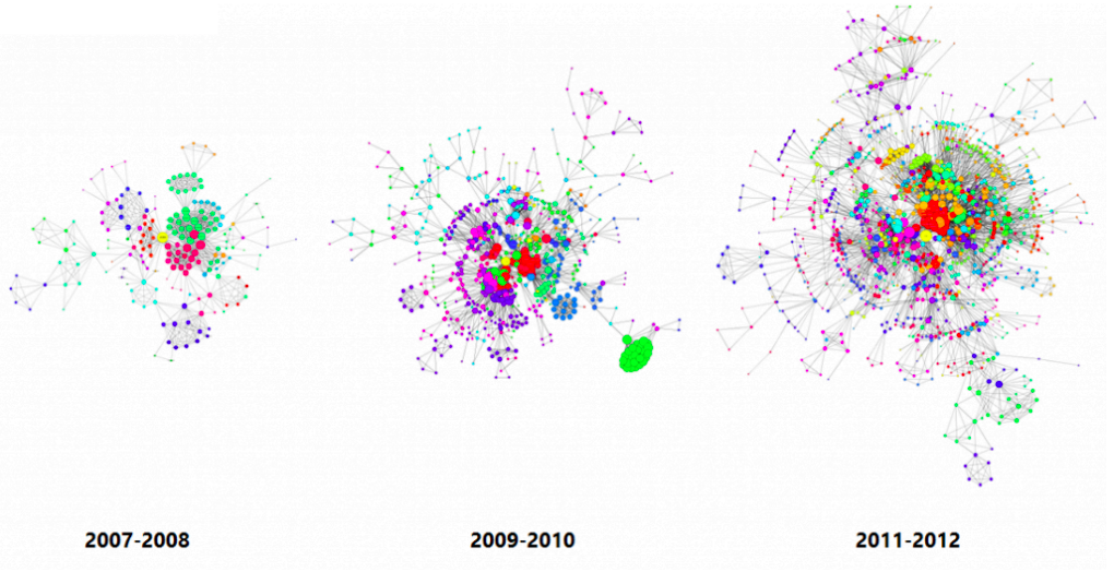
The picture below shows the largest components in Apple’s inventor network over a 6-year period. Each node reflects an inventor, each tie reflects a patent collaboration. Node colors reflect technology classes, while node sizes show the overall connectedness of an inventor by measuring their total number of ties/collaborations (the node’s so-called degree centrality).
There are three levels of studying evolving networks:
- Macro level (evolving network models, densification).
- Meso level (Network motifs, communities).
- Micro level (Node, link properties – degree, network centrality).
Macroscopic evolution of networks
The questions we answer in this part are:
- What is the relation between the number of nodes n(t) and number of edges e(t) over time t?
- How does diameter change as the network grows?
- How does degree distribution evolve as the network grows?
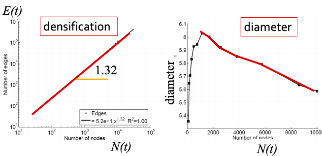
Q1: Let’s set at time t nodes N(t), edges E(t) and suppose that N(t+1) = 2 ⋅ N(t). What is now E(t+1)? It is more than doubled. Networks become denser over time obeying Densification Power Law: E(t) ∝ N(t)a where a is densification exponent (1 ≤ a ≤ 2). In other words, it shows that the number of edges grows faster than the number of nodes – average degree is increasing. When a=1, the growth is linear with constant out-degree (traditionally assumed), when a=2, the growth is quadratic – the graph is fully connected.
Q2: As the network grows the distances between the nodes slowly decrease, thus diameter shrinks over time (recap how we compute diameter in practice: with long paths, take 90th-percentile or average path length (not the maximum); with disconnected components, take only the largest component or average only over connected pairs of nodes).
But consider densifying random graph: it has increasing diameter (on picture below). There is more to shrinking diameter than just densification.

Comparing rewired random network to real network (all with the same degree distribution) shows that densification and degree sequence gives shrinking diameter.

But how to model graphs that densify and have shrinking diameters? (Intuition behind this: How do we meet friends at a party? How do we identify references when writing papers?)
Forest Fire Model
The Forest Fire model has 2 parameters: p is forward burning probability, r is backward burning probability. The model is Directed Graph. Each turn a new node v arrives. And then:
- v chooses an ambassador node w uniformly at random, and forms a link to w.
- Flip 2 coins sampled from a geometric distribution: generate two random numbers x and y from geometric distributions with means p / (1 − p) and rp / (1 − rp).
- v selects x out-links and y in-links of w incident to nodes that were not yet visited and form out-links to them (to ”spread the fire” along).
- v applies step (2) to the nodes found in step (3) (“Fire” spreads recursively until it dies; new node v links to all burned nodes).

On the picture above:
- Connect to a random node w.
- Sample x = 2, y = 1.
- Connect to 2 out- and 1 in-links of w, namely a,b,c.
- Repeat the process for a,b,c.
In the described way, Forest Fire generates graphs that densify and have shrinking diameter:
Also, Forest Fire generates graphs with power-law degree distribution:

We can fix backward probability r and vary forward burning probability p. Notice a sharp transition between sparse and clique-like graphs on the plot below. The “sweet spot” is very narrow.

Temporal Networks
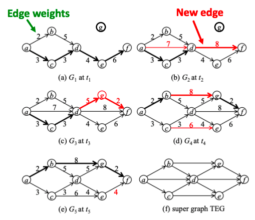
Temporal network is a sequence of static directed graphs over the same (static) set of nodes V. Each temporal edge is a timestamped ordered pair of nodes (ei = (u, v) , ti), where u, v ∈ V and ti is the timestamp at which the edge exists, meaning that edges of a temporal network are active only at certain points in time.

Temporal network examples:
- Communication: Email, phone call, face-to-face.
- Proximity networks: Same hospital room, meet at conference, animals hanging out.
- Transportation: train, flights.
- Cell biology: protein-protein, gene regulation.
Microscopic evolution of networks
The questions we answer in this part are:
- How do we define paths and walks in temporal networks?
- How can we extend network centrality measures to temporal networks?
Q1: Path
A temporal path is a sequence of edges (u1, u2, t1), (u2, u3, t2), … , (uj, uj+1, tj) for which t1 ≤ t2 ≤ ⋯ ≤ tj and each node is visited at most once.
To find the temporal shortest path, we use the TPSP-Dijkstra algorithm – an adaptation of Dijkstra using a priority queue. Briefly, it includes the following steps:
- Set distance to ∞ for all nodes.
- Set distance to 0 for ns (source node).
- Insert (nodes, distances) to PQ (priority queue).
- Extract the closest node from PQ.
- Verify if edge e is valid at tq (time of the query – we calculate the distance from source node ns to target node nt between time ts and time tq).
- If so, update v’s distance from ns.
- insert (v, d[v]) to PQ or update d[v] in PQ where d[v] is the distance of ns to v.
Q2: Centrality
Temporal closeness is the measure of how close a node is to any other node in the network at time interval [0,t]. Sum of shortest (fastest) temporal path lengths to all other nodes is:

where denominator is the length of the temporal shortest path from y to x from time 0 to time t.
Temporal PageRank idea is to make a random walk only on temporal or time-respecting paths.
- A temporal or time-respecting walk is a sequence of edges (u1, u2, t1), (u2, u3, t2), … , (uj, uj+1, tj) for which t1 ≤ t2 ≤ ⋯ ≤ tj.
As t → ∞, the temporal PageRank converges to the static PageRank. Explanation is this:
- Temporal PageRank is running regular PageRank on a time augmented graph:
- Connect graphs at different time steps via time hops, and run PageRank on this time-extended graph.
- Node u at ti becomes a node (u, ti) in this new graph.
- Transition probabilities given by P ((u, ti ), (x, t2 )) | (v, t0, (u, ti ) = β| Гu | .
- As t → ∞, β| Гu | becomes the uniform distribution: graph looks as if we superimposed the original graphs from each time step and we are back to regular PageRank.
How to compute temporal PageRank:
- Initiating a new walk with probability 1 − α.
- With probability α we continue active walks that wait in u.
- Increment the active walks (active mass) count in the node v with appropriate normalization 1−β.
- Decrements the active mass count in node u.
- Increments the active walks (active mass) count in the node v with appropriate normalization 1−β.
- Decrements the active mass count in node u.
In math words, temporal PageRank is:
![r(u,t) = \sum_{v \in C}^{} \sum_{k=0}^{t}(1-\alpha) \alpha ^{k} \sum_{z \in Z(v,u|t), |z|=k}P[z|t]](https://elizavetalebedeva.com/wp-content/ql-cache/quicklatex.com-9fd1f85c3c93b12f62169f147ddc6954_l3.png "Rendered by QuickLaTeX.com")
where Z(v,u | t ) is a set of all possible temporal walks from v to u until time t and α is the probability of starting a new walk.
Case Studies for temporal PageRank:
- Facebook: A 3-month subset of Facebook activity in a New Orleans regional community. The dataset contains an anonymized list of wall posts (interactions).
- Twitter: Users’ activity in Helsinki during 08.2010– 10.2010. As interactions we consider tweets that contain mentions of other users.
- Students: An activity log of a student online community at the University of California, Irvine. Nodes represent students and edges represent messages.
Experimental setup:
- For each network, a static subgraph of n = 100 nodes is obtained by BFS from a random node.
- Edge weights are equal to the frequency of corresponding interactions and are normalized to sum to 1.
- Then a sequence of 100K temporal edges are sampled, such that each edge is sampled with probability proportional to its weight.
- In this setting, temporal PageRank is expected to converge to the static PageRank of a corresponding graph.
- Probability of starting a new walk is set to α = 0.85, and transition probability β for temporal PageRank is set to 0 unless specified otherwise.
Results show that rank correlation between static and temporal PageRank is high for top-ranked nodes and decreases towards the tail of ranking:

Another finding is that smaller β corresponds to slower convergence rate, but better correlated rankings:

Mesoscopic evolution of networks
The questions we answer in this part are:
- How do patterns of interaction change over time?
- What can we infer about the network from the changes in temporal patterns?
Q1: Temporal motifs
k−node l−edge δ-temporal motif is a sequence of l edges (u1,v1, t1), (u2,v2, t2), …, (ul,vl, tl) such that t1 < t2 < … < tl and tl – t1 ≤ δ. The induced static graph from the edges is connected and has k nodes.
Temporal motifs offer valuable information about the networks’ evolution: for example, to discover trends and anomalies in temporal networks.
δ-temporal Motif Instance is a collection of edges in a temporal graph if it matches the same edge pattern, and all of the edges occur in the right order specified by the motif, within a δ time window.

Q2: Case Study – Identifying trends and anomalies
Consider all 2- and 3- node motifs with 3 edges:
The study [Paranjape et al. 2017] looks at 10 real-world temporal datasets. Main results are:
- Blocking communication (if an individual typically waits for a reply from one individual before proceeding to communicate with another individual): motifs on the left on the picture below capture “blocking” behavior, common in SMS messaging and Facebook wall posting, and motifs on the right exhibit “non-blocking” behavior, common in email.

- Cost of Switching:
- On Stack Overflow and Wikipedia talk pages, there is a high cost to switch targets because of peer engagement and depth of discussion.
- In the COLLEGEMSG dataset there is a lesser cost to switch because it lacks depth of discussion within the time frame of δ = 1 hour.
- In EMAIL-EU, there is almost no peer engagement and cost of switching is negligible

Case Study – Financial Network
To spot trends and anomalies, we have to spot statistically significant temporal motifs. To do so, we must compute the expected number of occurrences of each motif:
- Data: European country’s transaction log for all transactions larger than 50K Euros over 10 years from 2008 to 2018, with 118,739 nodes and 2,982,049 temporal edges (δ=90 days).
- Anomalies: we can localize the time the financial crisis hits the country around September 2011 from the difference in the actual vs. expected motif frequencies.
